Designing Liger
- Hartley Chng
- Nov 30, 2025
- 3 min read

Updated: Feb 12
Here's a look at how Liger's look changed throughout their lifetime and the work behind designing a character.
The original sketches for Highs and Lows didn't have a lot of structure but you can see elements that stuck around throughout their development such as the cheek circles and the roundness.

You can also see the original concept of Liger standing out from the tigers and lions.

With the concept in place, I experimented with different styles for Liger.
I collected reference material of other animal cartoon characters like Pokemon and Lion from Steven Universe. At this point, Liger Inbetween didn't have a specific audience range but my animation style already fits in with young audiences anyway.
I found myself sketching this version the most and liking how it combined lion and tiger features.

Since it was intended for animation, I knew I would need to simplify the design so I could draw Liger quickly and consistently. I also find that simplifying a design cuts out the clutter and leaves a visually stronger and more iconic character design.
I was mainly working off memory of what real world ligers looked like because in primary school they were my favourite animal for a while, later to be topped by dugongs. I also broke down tigers and lions into basic shapes to be able to combine that into liger's design as well.
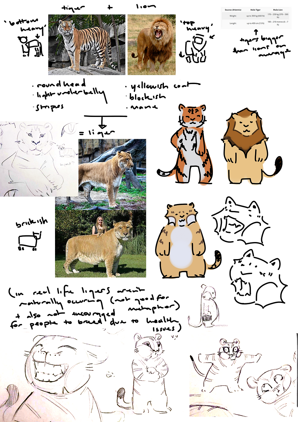
I listed out features and did some light research on their anatomy and found ways to differentiate the two.
I structured tigers to be circle based, rear heavy and larger. Lions would be square based, top heavy, overall thicker and shorter.
As you would see in my How to draw Liger post, Liger's base is both a circle and a square. They are a visual combination of both: circle and square based, balanced and between the height of tigers and lions.
It's important to me that these rules aren't concrete. Some tigers can be thicker, some lions can be taller.
Animating Highs and Lows, I was mostly drawing Liger from the shoulders up and so could skip out on posing the body. With It's Not Fair I won't be able to cheat like that, so I had to figure Liger's anatomy.
From left to right, I first redrew what Liger looked like in my short. I wanted to push Liger back to their earlier design, since I felt the oversized head felt too goofy.

You can also see me deconstruct Liger's head into a formula.

Happy with the third version of Liger, I measured out Liger more specifically. In uni, a character was measured in 'heads'. Realistic human characters are generally 8 heads tall and Liger moved from being about 3 to 4 heads. Splitting up their design meant I also had reference points. You can see how Liger's legs start at 0.5 heads, wrists at 1.5 heads, shoulders at 2.5 heads and eyes at 3.5 heads.

Finally, with a proper structure in place it's time for colour. I'm still working in this stage! Tigers, lions and Liger are all very warm colours (orange, yellow and brown) so I know I want to balance that out somehow with highlights in cool tones. Also, since I'm illustrating and not animating, I can add more flourish for the aesthetic as I only need to keep that going for about 40 illustrations (for each page) instead of however many frames it was in Highs and Lows.

That's all I can show off right now. Next Liger post will be how I'm designing characters Ace and Star for It's Not Fair :3


Comments